|
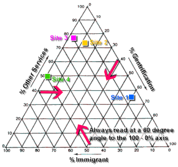
Example: Service structure data for selected urban
areas can be plotted on a three-sided triangular graph. The important features
of a triangular graph are:
-
Each axis is divided into 100, representing percentages.
-
From each 100-0% axis, lines are drawn at angles of 60 degrees
to carry the values.
-
The data used must be in the form of three compnents, each
component representing a percentage value, and the three component percentage
values must add up to 100 per cent.
The position of the plots indicates the relative dominance of
each of the three components and the value of the graph arises in giving a quick
visual comparison of contrasting component dominance for different areas. It is
particularly useful in identifying changes over time, since a position on the
graph will change as the relative dominance of the components change.
The graph can be used to show contrasting service structures for
4 locations in El Raval, an inner-city area of Barcelona which has been the
subject of radical urban reform. The choice of the three graph components is
important and must be in the context of the investigation. An example of data
from one location (El Raval Site 2) is shown in map 1 below, and this has been
used along with data from three other sites (1,3 and 4) to compile the
triangular graph.
| Key |
|
|
|
|
|
Gentrification |
|
|
Immigrant Services |
|
|
Local Services |
|
|
Professional Services |
|
|
Services of Poverty |
|
|
Training Centres |
|
|
Workshops |
|
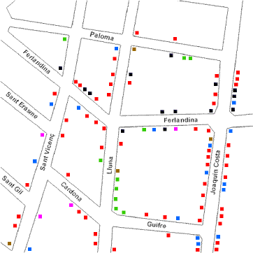
Map 1: Service Structure in El Raval, Site 2
|
Service Structure Data Summary Chart for Sites1-4
| El Raval Service Structure |
| Service |
Site 1 |
Site 2 |
Site 3 |
Site 4 |
| % Gentrification |
60 |
11.4 |
3 |
0 |
| % Immigrant Services |
5 |
15.2 |
20 |
50 |
| % Other Local Services |
35 |
73.4 |
76 |
50 |
| Total |
100 |
100 |
100 |
100 |
|
Data example is for training purposes only. Its accuracy
cannot be guaranteed. |
Triangular graph to show the contrasting service structure
for four areas of El Raval
|