|
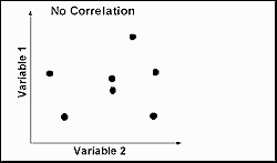
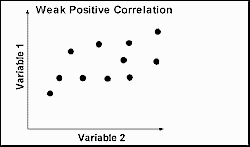
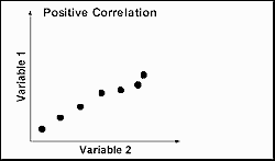
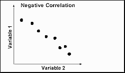
Scattergraphs are used to investigate the relationship between
two variables (or aspects) for a set of paired data. The pattern of the scatter
describes the relationship as shown in the examples below. Best-fit or trend
lines should:
-
Follow the trend of the data
-
Join as many points as possible
-
Leave an equal number of unjoined points on either side.
Rollover the scattergraphs below to see the lines of best-fit.
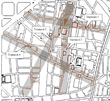
Example: Price changes of a convenience item along an
environmental gradient in El Raval, Barcelona. The hypothesis tested is that
prices should decrease with distance from the key area of gentrification
surrounding the Contemporary Art Museum. The line followed is Transect 2 in the
map below, with continuous sampling of the price of a small bottle water at
every convenience store.
Map to show the location of environmental gradients for
transect lines in El Raval, Barcelona
|
Distance along transect from Contemporary Art Museum |
Price of a small bottle of water (euros) |
| 1 |
1.80 |
| 2 |
1.20 |
| 3 |
2.00 |
| 4 |
1.00 |
| 5 |
1.00 |
| 6 |
1.20 |
| 7 |
0.80 |
| 8 |
0.60 |
| 9 |
1.00 |
| 10 |
0.85 |
Example of a scattergraph for the above data, with the line of
best-fit to be drawn.
Spearman's Rank Correlation Coefficient is a further technique
for analysing this data set and is illustrated in the Statistical
Techniques section
|