|
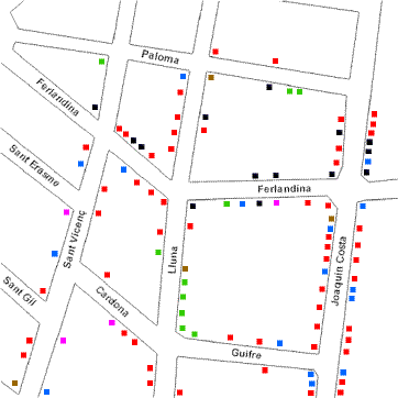
Example: El Raval service structure data for Site 2
with percentage values.
| Key |
|
|
|
|
|
Gentrification |
|
|
Immigrant Services |
|
|
Local Services |
|
|
Professional Services |
|
|
Services of Poverty |
|
|
Training Centres |
|
|
Workshops |
|

Map 1: Service Structure in El Raval, Site 2
|
Service Structure Data Summary Chart Site 2
| El Raval Site 2 |
| Service |
Number |
% |
| Gentrification |
12 |
11.4 |
| Immigrant Services |
16 |
15.2 |
| Local Services |
61 |
58.1 |
| Professional Services |
10 |
9.5 |
| Services of Poverty |
3 |
2.9 |
| Training Centres |
0 |
0 |
| Workshops |
3 |
2.9 |
| Total |
105 |
100 |
| Size of area: 0.25 x 0.25 km² = 0.0625 km² |
| No. of businesses per km² = 1,680 |
Chart to show The Structure of Services in El Raval Site 2
Advantages
-
display relative proportions of multiple classes of data
-
size of the circle can be made proportional to the total
quantity it represents
-
summarize a large data set in visual form
-
be visually simpler than other types of graphs
-
permit a visual check of the reasonableness or accuracy of
calculations
-
require minimal additional explanation
-
be easily understood due to widespread use in business and the
media
Disadvantages
-
do not easily reveal exact values
-
Many pie charts may be needed to show changes over time
-
fail to reveal key assumptions, causes, effects, or patterns
-
be easily manipulated to yield false impressions
|