|
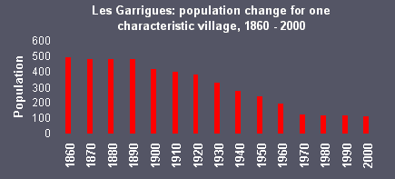
Bar graphs are good for showing how data change over time.
Example:
Advantages
-
show each data category in a frequency distribution
-
display relative numbers or proportions of multiple categories
-
summarize a large data set in visual form
-
clarify trends better than do tables
-
estimate key values at a glance
-
permit a visual check of the accuracy and reasonableness of
calculations
-
be easily understood due to widespread use in business and the
media
Disadvantages
-
require additional explanation
-
be easily manipulated to yield false impressions
-
fail to reveal key assumptions, causes, effects, or patterns
|